deviant art

Deviant Login Shop  Join deviantART for FREE Take the Tour
[x]
Shop Similar Prints
This Print Not Available
more ▶

More from *insolitus85

Featured in Groups:

Details

February 27, 2012
619 KB
1505×1505
Sta.sh
Link
Thumb

Statistics

Comments: 0
Favourites: 6 [who?]

Views: 411 (1 today)

Camera Data

Canon
Canon EOS 5D Mark II
1/512 second
F/inf
50 mm
100
Feb 11, 2012, 2:10:17 PM
Adobe Photoshop CS4 Windows
20mm
[x]
:iconinsolitus85:
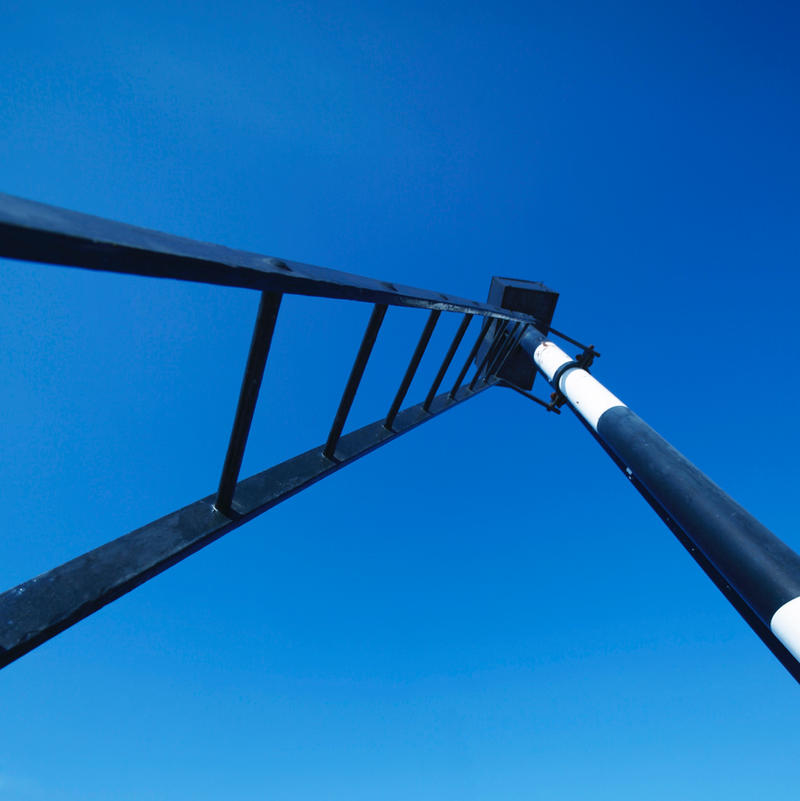
Rotterdam, The Netherlands, February 2012

Some more abstracts...


:iconccwelcomedplz1::iconccwelcomedplz2:


I don't have as much (free) time as I would like. So thank you in advance for any :+fav:'s, they are highly appreciated! (As are comments....)
:iconeinsilbig:
As a lover of abstract i can say the following from my perspective:
In my opinion it is too recognizable, the sky, the whole subject.
That´s totally OK if something is less abstracted i search for a
hidden meaning in what looks real on first sight - but i don´t see
one. In conclusion, i don´t think that the word "abstract" does
fit this picture really well.
As i have a problem with the abstraction, i search for other
appealing aspects, but also in aesthetical ways it just doesn´t
make an impression on me.

This is my personal and subjective opinion, you have wonderful
works and you know how to abstract. I consider this one to be
one of your weaker works and i hope my critique was useful.

Have a wonderful week,

E.
What do you think?
The Artist thought this was FAIR
13 out of 13 deviants thought this was fair.

:iconzouberi:
According to your journal, you are desperately in need of a critique on this work. So here we go:
First of all, I think the photo is pretty unique as it is, that is why I gave it a high rating in originality. I don't think that anyone else would capture the motive in the way you did. That takes me to the next point, vision and impact. Often a photographer sees things, other don't. I'm sure that there's a lot more meaning and/or a deeper impact in the image for yourself as for the "normal" viewer. Also, your technique is almost perfect, there's nothing to complain about it. The weaker side of the piece is its impact on others, I think. I can only guess (since I personally think it's an overall good work) what causes the fact, that it's not one of your more popular deviations. Maybe it's the angle, which is quite unusual (well, that is good for abstract photography, though). Maybe it's the (too?) realistic colours, I'd really like to see it in black and white to compare... Maybe it's the composition; the motive is close to the centre, squares are quite in vogue at the moment, but maybe it doesn't work so well here. Or maybe, it's a bit of all of those thoughts or there are other things as well, which I can't figure out now...
Anyways, it's definitely not bad and I believe that not every photograph has to have lots of favourites to be a good one. Keep it up and keep this work, too!
I hope that this will help you a bit. =)
What do you think?
The Artist thought this was FAIR
5 out of 7 deviants thought this was fair.

The Artist has requested Critique on this Artwork

Please sign up or login to post a critique.

No comments have been added yet.

Add a Comment: